Graphic Design
While the industry has evolved, my design skills have seamlessly integrated into my front-end development work, particularly in layout and aesthetics. I can create icons and graphic layouts, leveraging my artistic background.
Instead of mundane graphics, here is a brief exhibition of my more elaborate designs for you to enjoy.

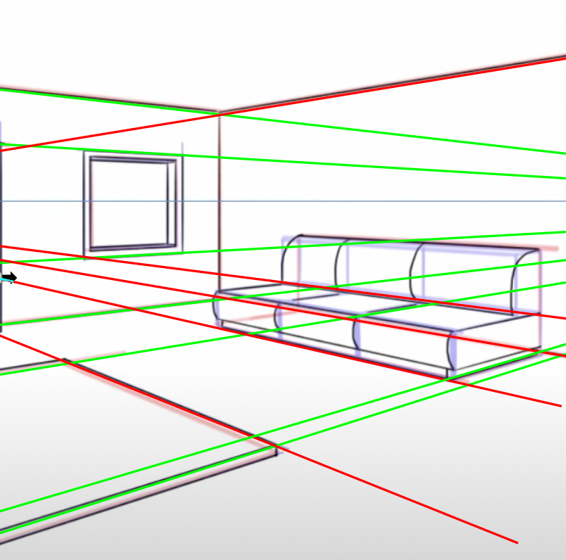
A Matter Of Perspective
The first image showcases my process of setting up the perspective like a wireframe before drawing the actual image. In this example, I am drawing a sitting room, a challenging task because the human eye can easily detect even the slightest perspective errors. This is why such drawings, though they may appear simple, require meticulous planning and time.

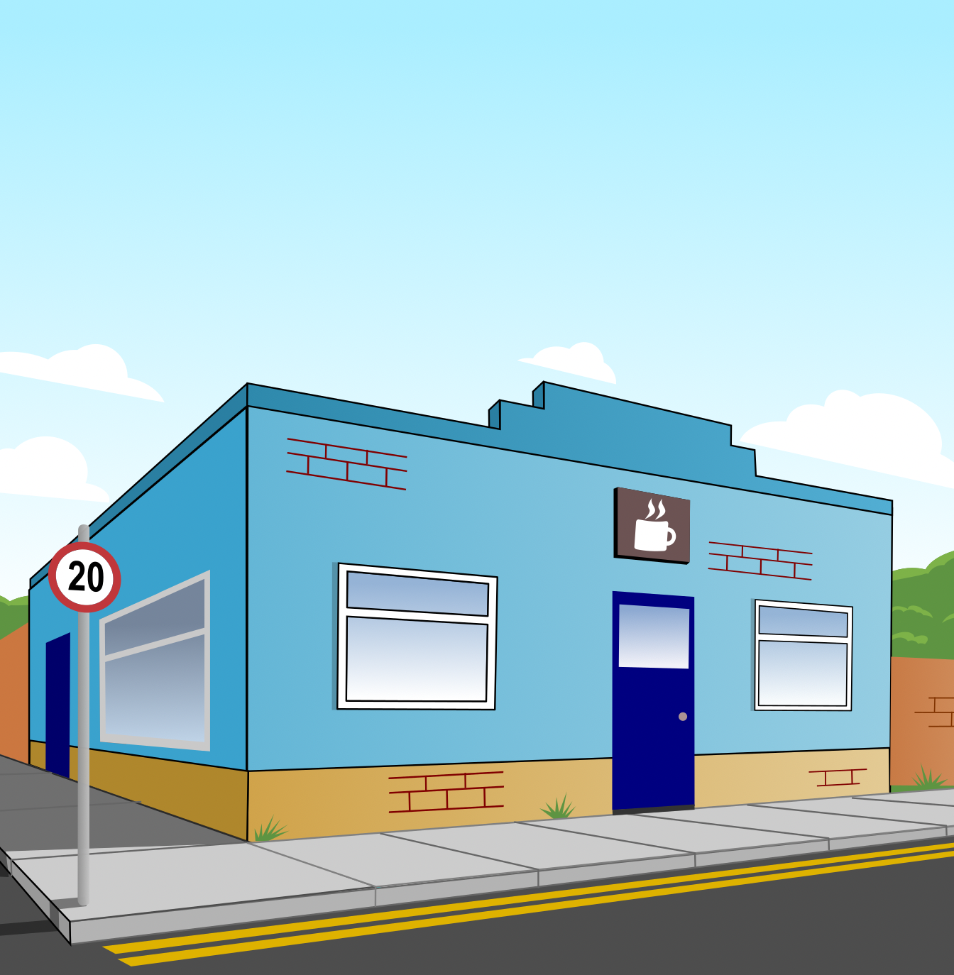
A Coffee Shop Scene
The next image is a drawing of a coffee shop rendered in perspective and filled in using vector-based graphics. Here, I apply color theory to choose harmonious colors, enhancing the overall visual appeal. I particularly enjoy adding clouds with a clean cut-off at the bottom. Additionally, I include minute details like irregular brickwork and a few blades of grass to add depth without overwhelming the image. It is all about finding the right balance.

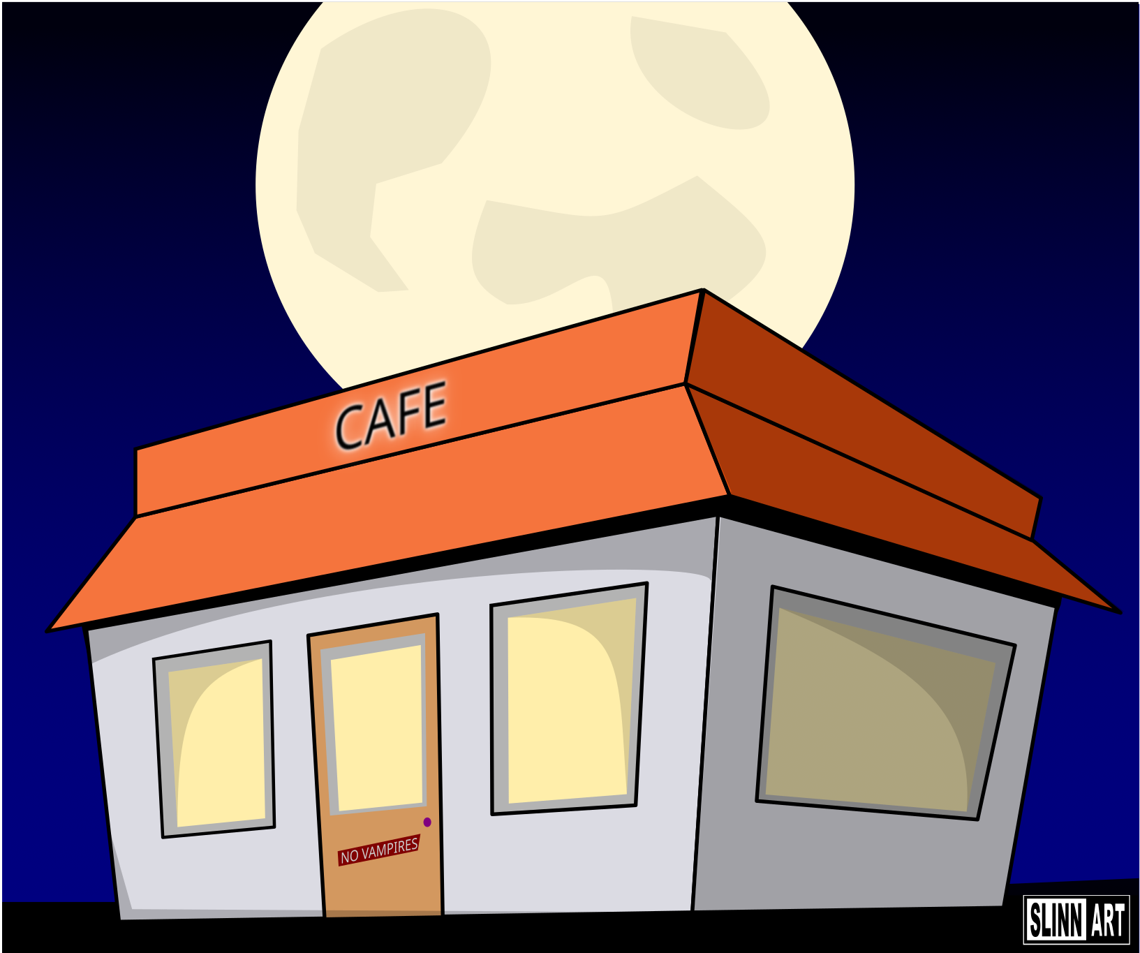
An Impossible Cafe
A great design should look simple, and the cartoon perspective effect, though time-consuming to master, yields impressive outcomes, especially for logos and eye-catching adverts. This technique is used in popular cartoon shows like The Simpsons, Rick & Morty, and Family Guy. While it defies real-world possibilities, it cleverly tricks the eye into believing it is plausible.

Logo design
Transforming the letter "G" into a logo involves using vibrant colors, fill techniques, and ornate curves. These elements elevate the letter from simple to sophisticated. Bright colors attract attention, fill adds depth, and curves introduce elegance. Together, these design choices turn the "G" into a memorable and impactful pictographic logo.

Every plaque has its place
The final piece is a plaque I designed for my home gym. This logo was printed on 2cm shiny vinyl, allowing me to hang it as a plaque in my gym. It is the result of several iterations, experimenting with various colors from reds to blues, before arriving at this final design. A good logo should speak for itself without the need for the designer to explain their subjective perspective.